Reading a Theme Park's Mind with PCA
What 600,000 queue-time readings can tell you about how people move through Knoebels
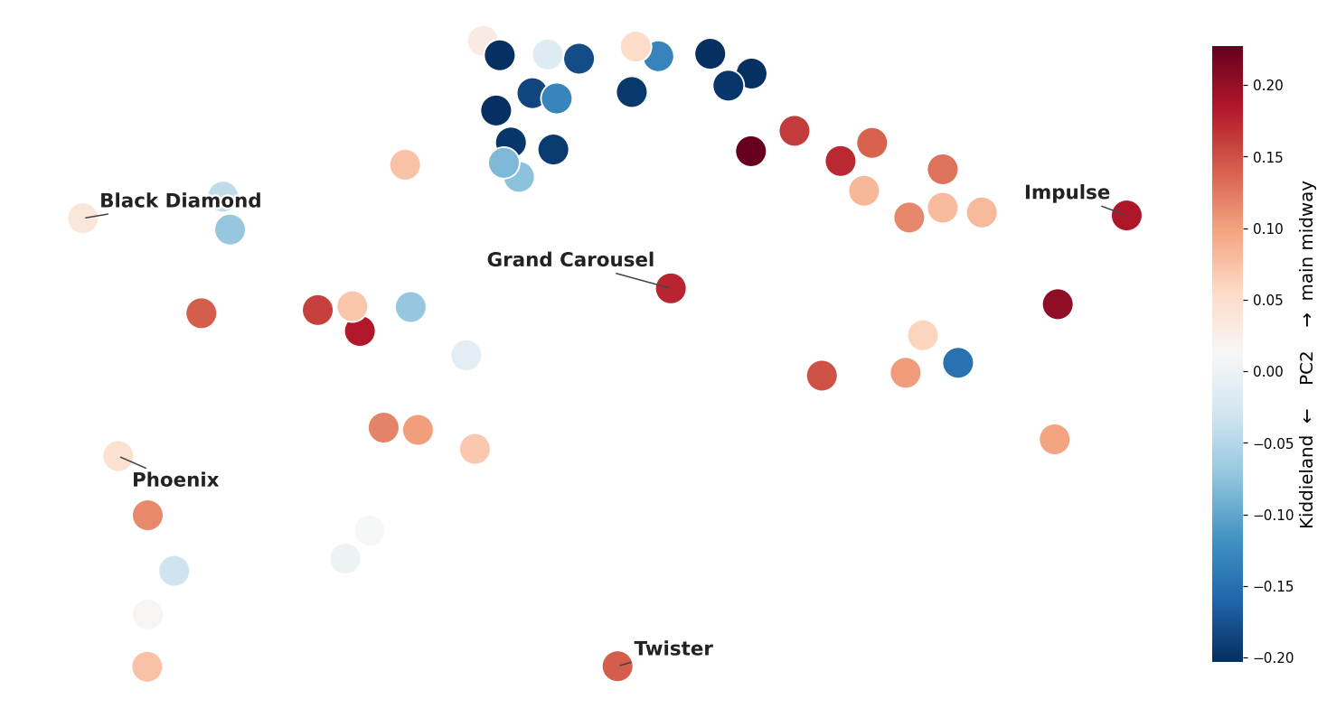
I'm working my way through An Introduction to Statistical Learning and Gilbert Strang's linear algebra lectures, and I got impatient. Principal Component Analysis sits a few chapters ahead of where I am, but I had a dataset I couldn't stop thinking about, so I skipped ahead and used it as an excuse to learn PCA by doing. This notebook is me figuring it out live.
The data. Every few minutes, a scraper records the posted wait time for each ride at Knoebels (a wonderful, old amusement park in Pennsylvania). Two seasons of that adds up to ~600k readings across ~57 rides.
The question. If I don't tell the algorithm anything about the rides — not which are roller coasters, not which are for toddlers, not where they sit in the park — can it still discover the hidden "axes" that explain how the whole park behaves? That's exactly what PCA is for: it finds the handful of directions that explain the most variation in the data, and leaves us to interpret them.
Spoiler: it finds three, and they turn out to be how busy the park is, which half of the park you're in, and what time of day it is — none of which it was ever told.
The data: one big table of waits
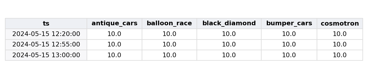
The natural shape for this is a table where every row is a moment in time (a 5-minute snapshot of the park) and every column is a ride. Each cell is the wait, in minutes, for that ride at that moment.
A couple of small judgment calls in building it:
- Forward-fill, then zero. If a ride didn't report at 2:05 we carry its 2:00 value forward (the line probably didn't teleport). Anything still missing — like early morning before the ride opens — becomes 0.
- Drop
powersurge. It hasn't been running for most of the time since I began collecting data; ~90% of its column is imputed zeros, so it only adds noise.
import os
from pathlib import Path

import pandas as pd
from dotenv import load_dotenv
from sqlalchemy import create_engine, text

load_dotenv(Path.cwd() / ".env")
engine = create_engine(
    "postgresql+psycopg2://{user}:{pw}@{host}:{port}/{db}".format(
        user=os.environ["PG_USER"], pw=os.environ["PG_PASSWORD"],
        host=os.environ["PG_HOST"], port=os.environ["PG_PORT"], db=os.environ["PG_DB"],
    )
)

df = pd.read_sql(
    text(
        """
        SELECT a.time_stamp,
               r.ride        AS ride_name,
               a.queue_time  AS queue_time_sec
          FROM knoebels."LZ_attractions_io" a
          JOIN knoebels.ride_master r ON r.attractions_dot_io_id = a._id
         WHERE a.queue_time IS NOT NULL
        """
    ),
    engine,
)
df["queue_time_min"] = df["queue_time_sec"] / 60.0
df["time_stamp"] = pd.to_datetime(df["time_stamp"])


def ride_time_matrix(df, freq="5min"):
    """Long table -> (time x ride) matrix of mean wait in minutes per time bin."""
    snapped = df.assign(ts=df["time_stamp"].dt.floor(freq))
    return (
        snapped.pivot_table(index="ts", columns="ride_name",
                            values="queue_time_min", aggfunc="mean")
        .sort_index()
        .ffill()      # carry the last known wait forward
        .fillna(0)    # anything still missing (pre-open) = no line
    )


df_matrix = ride_time_matrix(df).drop(columns=["powersurge"], errors="ignore")
print(f"{len(df):,} readings  ->  matrix of {df_matrix.shape[0]:,} time-snapshots x {df_matrix.shape[1]} rides")
df_matrix.iloc[:3, :5]
635,995 readings -> matrix of 12,073 time-snapshots x 56 rides
Step 1: put every ride on the same footing
Here's the first thing that bit me. PCA hunts for directions of maximum variance — but "variance" is measured in whatever units the data is in. A headline roller coaster might swing between 5 and 45 minutes; a kiddie ride swings between 0 and 6. If I feed in raw minutes, PCA will conclude the coaster is "more important" purely because its numbers are bigger, and the small rides will be invisible.
The fix is to standardize every column: subtract its mean and divide by its standard deviation, so each ride has mean 0 and variance 1. Now a "big day" for the kiddie carousel counts just as much as a big day for the coaster. We're asking about patterns of co-movement, not raw magnitudes.
from sklearn.preprocessing import StandardScaler

scaler = StandardScaler()
scaled = scaler.fit_transform(df_matrix)   # each column now mean 0, variance 1
pd.DataFrame(scaled, columns=df_matrix.columns).describe().loc[["mean", "std"]].iloc[:, :4].round(2)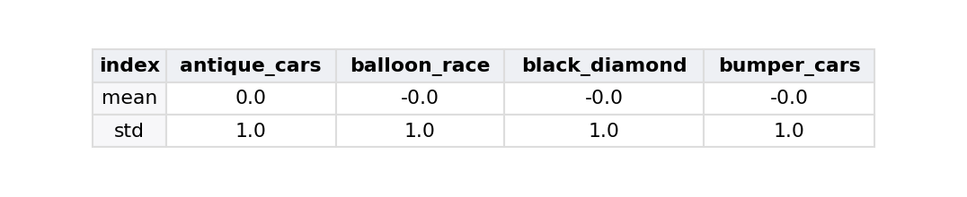
Step 2: ask for the axes of variation
This is the part I'd been intimidated by, and it turned out to be a clean idea.
We have ~57 ride-columns, but they're hugely redundant — when the park is mobbed, everything gets busy together. PCA asks: can I describe most of that 57-dimensional wobble with just a few new axes? Each axis (a principal component) is a weighted blend of the original rides, chosen so the first one captures as much variance as possible, the second captures as much of what's left as possible while being perpendicular to the first, and so on.
The linear algebra underneath is the singular value decomposition. Our standardized matrix X factors as
X = U Σ Vᵀ
The columns of V are the new axes — the loadings, telling us how much each ride contributes to each component. UΣ gives the scores — where each time-snapshot lands along those axes. And the singular values in Σ, squared, tell us how much variance each axis explains. sklearn's PCA does exactly this and hands back the pieces with friendly names.
I asked for the top 3 components. Look at how concentrated the signal is:
from sklearn.decomposition import PCA

pca = PCA(n_components=3)
principal_components = pca.fit_transform(scaled)

scores = pd.DataFrame(principal_components, index=df_matrix.index,
                      columns=["PC1", "PC2", "PC3"])
loadings = pd.DataFrame(pca.components_.T, index=df_matrix.columns,
                        columns=["PC1", "PC2", "PC3"])

for i, pc in enumerate(["PC1", "PC2", "PC3"]):
    print(f"{pc}: {pca.explained_variance_ratio_[i]:5.1%} of all variance")
print(f"{'':4} {pca.explained_variance_ratio_[:3].sum():5.1%} captured by just 3 axes (out of 56)")
PC1: 40.4% of all variance
PC2: 13.0% of all variance
PC3: 6.7% of all variance
60.1% captured by just 3 axes (out of 56)
Three axes out of fifty-six explain ~60% of everything. The rest is (probably) ride-specific noise (I am meaning to examine the 4th component, our of curiosity). Now the fun part — what are these three axes? PCA won't tell us; it just hands us numbers. We have to read them.
My approach for each component: look at which rides load heavily on it (the loadings), form a hypothesis about what real-world thing that represents, then validate the hypothesis against something the PCA never saw.
PC1 — the whole park breathes together
The first component is the easiest. Every single ride loads on it with the same sign — they all move together. That's the signature of one global force: overall busyness. Empty Tuesday morning, the whole park is near zero; packed Saturday afternoon, everything spikes at once.
The test: if PC1 is really "busyness," then a snapshot's PC1 score should track the plain average wait across all rides at that moment. To make that easy to eyeball, I put both quantities on the same standardized scale — so if PC1 were exactly the average wait, every dot would land on the dashed 45° line. The red line is the actual relationship (its slope is the correlation). For PC1 the red line sits almost on top of the diagonal:
import numpy as np
import matplotlib.pyplot as plt


def validation_plot(real_quantity, pc_score, score_name, xlabel):
    """Put a PC score and the real-world quantity it should track on the same
    standardized scale. If the PC *were* that quantity every dot would sit on the
    dashed 45° line; the red line is the actual fit (its slope is the correlation
    r). The closer red hugs the diagonal, the stronger the validation."""
    zx = (real_quantity - real_quantity.mean()) / real_quantity.std()
    zy = (pc_score - pc_score.mean()) / pc_score.std()
    r = real_quantity.corr(pc_score)

    fig, ax = plt.subplots(figsize=(7, 6.5))
    ax.scatter(zx, zy, s=4, alpha=0.12, color="steelblue")
    line = np.array([-3, 3])
    ax.plot(line, line, "k--", lw=1.3, label="perfect match (y = x)")
    ax.plot(line, r * line, color="crimson", lw=2.5,
            label=f"actual relationship (r = {r:.2f})")
    ax.set(xlim=(-3, 3), ylim=(-3, 3), aspect="equal",
           xlabel=f"{xlabel}  (standardized)",
           ylabel=f"{score_name} score (standardized)")
    ax.set_title(f"{score_name}: does it track the real-world quantity?")
    ax.legend(loc="upper left")
    plt.tight_layout()


park_mean = df_matrix.mean(axis=1)
validation_plot(park_mean, scores["PC1"], "PC1", "Park-wide mean wait")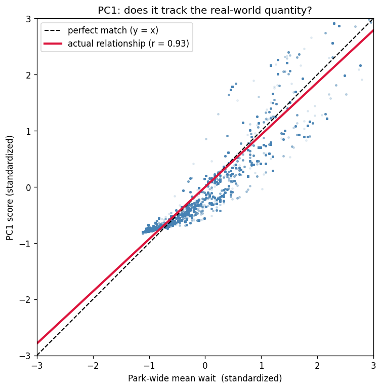
PC2 — Kiddieland vs. Everything else
PC2 is a contrast: some rides load positive, others negative. Reading the extremes, the negative end is dominated by the tiny-tots rides (kiddie_boats, pony_carts, red_baron...) and the positive end by the big rides in the rest of the park. So my first guess was "kiddie rides vs. everything else."
The category tag is a trap
The park's own data tags each ride Kiddie / Family / Thrill, so I reached for that to define the two groups — and got a muddy result. Two problems:
- The tag values secretly carry a trailing space (
"Kiddie ", not"Kiddie"), so naive equality checks silently matched nothing. (Lesson learned: avalue_counts()printout will never show you that.) - Even cleaned up, the tag misfiles rides relative to how they behave. The big Ferris wheel (
giant_wheel) and the largegrand_carouselare taggedFamilybut behave like non-kiddie-land rides; the smalls&g_carouselis taggedFamilybut behaves like a Kiddieland ride.
PC2 isn't tracking the taxonomy — it's tracking physical geography: the Kiddieland corner vs. the rest of the park. So let me define the two groups from geometry the PCA never touched, and see if the contrast gets sharper.
Validating from the map
Each ride has a GPS coordinate. I run k-means on just the lat/lon (no queue data, no PCA) to carve the park into areas, and call the cluster with the lowest mean PC2 loading "Kiddieland." Then I build the contrast rest-of-the-park mean − Kiddieland mean and check it against PC2.
(Small but important detail: standardize the coordinates first. On raw degrees the clustering is unstable from one random seed to the next; standardized, it's identical every run.)
from sklearn.cluster import KMeans

# category tag, with the sneaky trailing space trimmed off
category = pd.read_sql(
    text(
        """
        SELECT r.ride AS ride_name, trim(c.name) AS category
          FROM knoebels.ride_master r
          JOIN knoebels."LZ_attractions_io_poi" p ON p._id = r.attractions_dot_io_id
          LEFT JOIN knoebels."LZ_attractions_io_categories" c ON c._id = p.category
        """
    ),
    engine,
).set_index("ride_name")["category"]

coords = pd.read_sql(
    text(
        """
        SELECT r.ride AS ride_name,
               (p.location)[0]::float AS lat, (p.location)[1]::float AS lon
          FROM knoebels.ride_master r
          JOIN knoebels."LZ_attractions_io_poi" p ON p._id = r.attractions_dot_io_id
         WHERE p.location IS NOT NULL
        """
    ),
    engine,
).set_index("ride_name")

annotated = loadings.join(category.rename("category"))
located = annotated.join(coords, how="inner")

# k-means on STANDARDIZED coordinates only -> reproducible spatial areas
located["area"] = KMeans(n_clusters=5, n_init=10, random_state=0).fit_predict(
    StandardScaler().fit_transform(located[["lat", "lon"]])
)
kiddie_area = located.groupby("area")["PC2"].mean().idxmin()
kiddie_rides = located.index[located["area"] == kiddie_area]
main_rides   = located.index[located["area"] != kiddie_area]

# Does the map agree? Left: each ride at its real GPS point, colored by PC2
# loading. Right: areas from clustering lat/lon alone — no queue data, no PCA.
fig, axes = plt.subplots(1, 2, figsize=(15, 7))
sc = axes[0].scatter(located["lon"], located["lat"], c=located["PC2"],
                     cmap="RdBu_r", s=140, edgecolor="black", lw=0.4)
axes[0].set(title="Each ride at its real location, colored by PC2 loading\n"
                  "(blue = Kiddieland end, red = main-midway end)",
            xlabel="Longitude", ylabel="Latitude")
plt.colorbar(sc, ax=axes[0], label="PC2 loading")
for ride, row in located.iterrows():
    axes[0].annotate(ride, (row["lon"], row["lat"]), fontsize=6, alpha=0.6,
                     xytext=(3, 3), textcoords="offset points")
for area, g in located.groupby("area"):
    label = f"Area {area}" + (" (Kiddieland)" if area == kiddie_area else "")
    axes[1].scatter(g["lon"], g["lat"], label=label, s=140, alpha=0.85)
axes[1].set(title="k-means on standardized lat/lon alone\n(no queue data, no PCA)",
            xlabel="Longitude", ylabel="Latitude")
axes[1].legend()
plt.tight_layout()
print(f"Kiddieland ({len(kiddie_rides)} rides): {', '.join(sorted(kiddie_rides))}")
Kiddieland (19 rides): goin'_buggy, hand_cars, haunted_mansion, helicopters, jet_skyfighter, kiddie_boats, kiddie_bumper_cars, kiddie_firetrucks, kiddie_wheel, kiddie_whip, ole_smokey, panther_cars, pete's_fleet, pony_carts, red_baron, ribbit, s&g_carousel, spanish_bambini, umbrella_ride
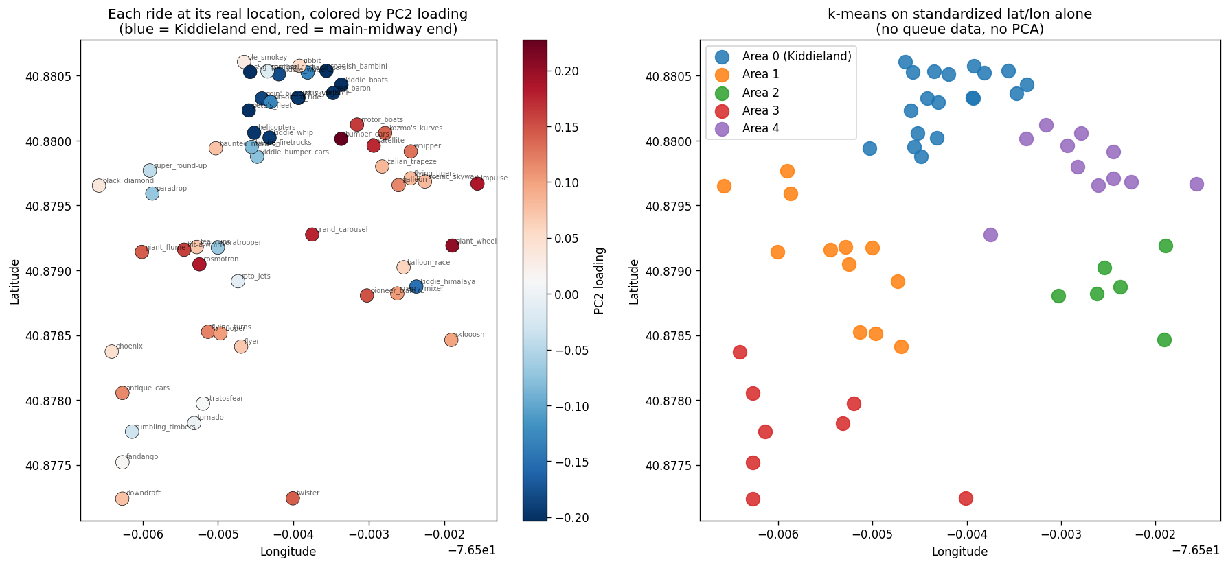
The blue (negative-PC2) rides really do huddle in one corner of the park — and clustering the coordinates on their own rediscovers that same corner without ever touching a wait time. So PC2 is genuinely spatial. Now the quantitative check: take rest-of-the-park mean − Kiddieland mean at each moment and see how tightly it tracks the PC2 score.
contrast = df_matrix[main_rides].mean(axis=1) - df_matrix[kiddie_rides].mean(axis=1)
validation_plot(contrast, scores["PC2"], "PC2", "Main-midway − Kiddieland wait")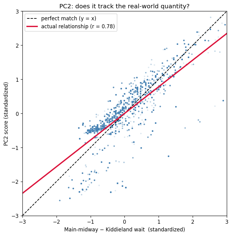
r ≈ 0.78, built from coordinates the model never saw, and giant_wheel / grand_carousel correctly land on the non-kiddie-land side while s&g_carousel lands in Kiddieland — exactly the rides the category tag got wrong. PC2 is where in the park you are.
PC3 — morning school groups vs. the evening crowd
PC3 was the one I got wrong at first, it's important to not be afraid to throw out an attractive hypothesis.
My initial hypothesis was ride throughput: "people-eater" walk-on rides vs. low-capacity rides that build a line. It's a tidy story, and it's wrong here:
- The
capacityanddurationcolumns I'd have needed are completely empty in this dataset, so I couldn't even compute throughput. - When I split rides by their PC3 sign and compared actual wait behavior, the two groups were a near-tie (mean wait 9.8 vs. 8.8 min). PC3 simply doesn't separate "builds a line" from "walk-on."
What it does separate is time of day. The PC3 score runs strongly positive at midday and strongly negative after dark. So the rides loading positive are busy in the daytime, and the ones loading negative are busy in the evening — and that maps onto a real thing about how Knoebels operates:
Knoebels runs discounted group rates for schools and daycares, who arrive at open and leave by mid-afternoon. Those big groups of little kids hammer the daytime family flat-rides (tea cups, tilt-a-whirl, paratrooper). After they clear out, the evening belongs to teens and date-night couples on the coasters, bumper cars, and the Ferris wheel at dusk.
The test: de-trend each group's wait by the park-wide average for that hour (so we're looking at shape, not PC1's overall nightly ramp), and watch the two groups pull apart across the day.
daytime_rides = loadings.index[loadings["PC3"] > 0.1]
evening_rides = loadings.index[loadings["PC3"] < -0.1]

hour = df_matrix.index.hour
park_by_hour = df_matrix.mean(axis=1).groupby(hour).mean()

fig, axes = plt.subplots(1, 2, figsize=(14, 5))

# left: the axis itself, by hour
scores.groupby(scores.index.hour)["PC3"].mean().plot(ax=axes[0], marker="o")
axes[0].axhline(0, color="grey", lw=0.5)
axes[0].set(title="PC3 score by hour  (+ daytime / − evening)",
            xlabel="Hour (local)", ylabel="Mean PC3 score")

# right: each group's wait as a share of the park-wide level, de-trended
for name, grp, color in [("daytime rides (PC3 +)", daytime_rides, "tab:orange"),
                         ("evening rides (PC3 −)", evening_rides, "tab:blue")]:
    (df_matrix[grp].mean(axis=1).groupby(hour).mean() / park_by_hour).plot(
        ax=axes[1], marker="o", label=name, color=color)
axes[1].axhline(1.0, color="grey", lw=0.5)
axes[1].set(title="Group wait ÷ park-wide wait, by hour",
            xlabel="Hour (local)", ylabel="Share of park-wide mean wait")
axes[1].legend()
plt.tight_layout()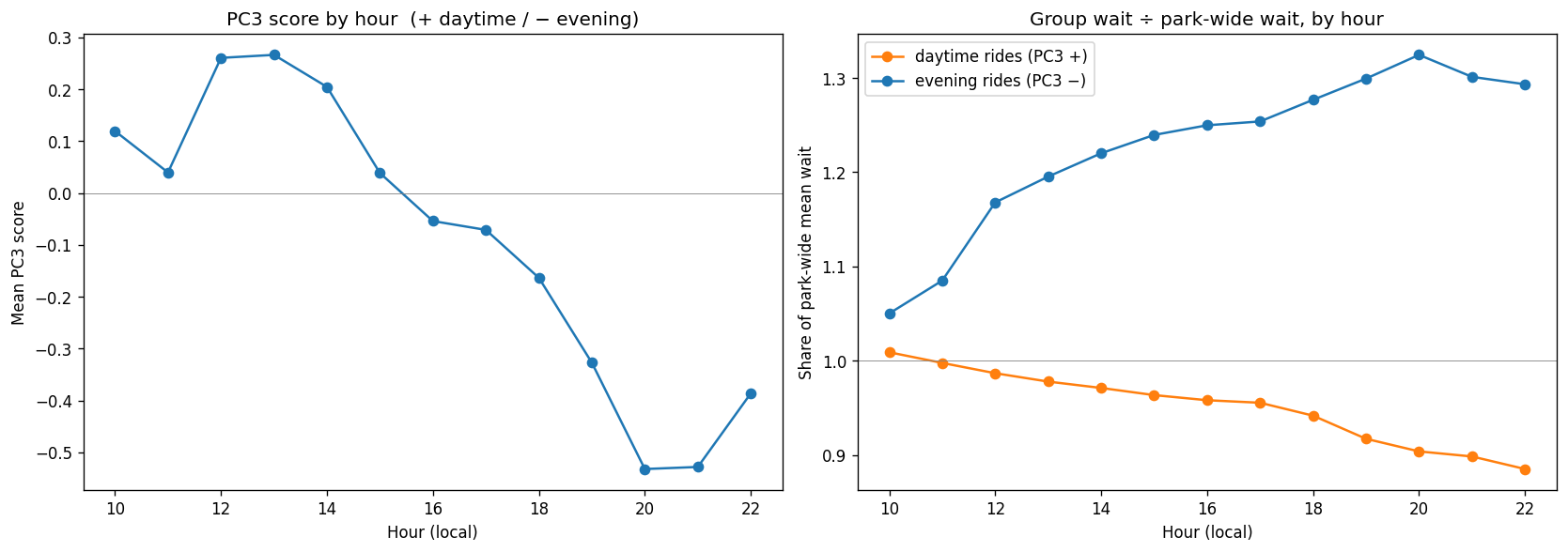
The daytime group fades through the afternoon while the evening group climbs — and the school-group operating detail is part of the mechanism. PC3 is what time of day it is.
(There's a mild bit of circularity worth flagging: I defined the two groups using the PC3 loadings, so this plot confirms what the axis means more than it's a fully independent test. The genuinely external evidence is the operational fact about group rates.)
What PC3 adds that PC2 doesn't
It's fair to ask what's left for PC3 to do. PC2's score also drifts with the clock — kiddie-heavy in the morning, rest of the park by night.
The mechanics: each component assigns every ride a single number (its loading), and the axes are built to be independent — here PC2 and PC3 correlate 0.00. PC2 spends its one-number-per-ride on a single question — kiddie corner or rest of the park? — so every grown-up ride gets a similar positive loading. That makes PC2 structurally blind to the fact that, say, the tea cups and the giant Ferris wheel behave nothing alike. Both are just "not kiddie-land" to it.
# PC2 calls these two rides almost identical (both lean "not kiddie-land").
# PC3 sends them to opposite ends.
loadings.loc[["tilt-a-whirl", "giant_wheel"], ["PC2", "PC3"]].round(3)
PC2 puts them practically side by side (+0.16 and +0.20); PC3 sends them to opposite poles (+0.15 vs −0.18). And that matches the park exactly: the tilt-a-whirl is a daytime ride the school-and-daycare crowd swarms at opening, while the giant wheel is an evening ride — dusk views, the date-night crowd. To describe a ride as "non-kiddie-land and daytime" versus "non-kiddie-land and evening" takes two numbers, and the second one is PC3.
It even shows up in the shape of each axis across a day: PC2 is a steady all-day drift, PC3 a midday hump. So the three components stack into one clean read on the park:
- PC1 — how many people are here? (overall busyness)
- PC2 — which half of the park are they in? (kiddie corner ↔︎ elsewhere)
- PC3 — among the non-kiddie-land rides, which kind is peaking? (daytime family flat-rides ↔︎ evening marquee rides)
The gut-check for what "independent axes" really buys you: two moments can share an identical PC1 and PC2 — same crowd size, same kiddie/other balance — and still split on PC3. A midday with the flat rides surging versus an evening with the coasters and bumper cars going: same volume, same spatial tilt, different ride mix. PC3 is the only one of the three that can tell them apart.
An alternative map of the park, drawn from wait times alone
Here's the payoff. Plot every ride by its PC2 and PC3 loadings — its behavioral position — and color it by the park's category tag. Remember: the position comes purely from how each ride's queue moves over two seasons. The model was never told what any ride is or where it sits.
And yet the picture is the park. Kiddieland collapses into a tight cluster on the left. The evening thrill rides sink to the bottom-right. The daytime family flat-rides float to the top. The two blue dots stranded inside Kiddieland are the Family-tagged rides the queue data insists are really kiddie rides.
If you look at it through a wavy Victorian-era window and tilt your head just right, it does resemble the layout of the park, if only a little. Which I think is very cool insofar as it's generated using nothing but historical wait time estimates for each ride..
from matplotlib.patches import Ellipse

# the tight Kiddieland pile = rides loading hard-negative on PC2
kiddie_core = loadings.index[loadings["PC2"] < -0.13]
kx, ky = loadings.loc[kiddie_core, "PC2"], loadings.loc[kiddie_core, "PC3"]

fig, ax = plt.subplots(figsize=(11, 8.5))
cat_colors = {"Family": "tab:blue", "Kiddie": "tab:orange", "Thrill": "tab:red"}
for c, g in annotated.dropna(subset=["category"]).groupby("category"):
    ax.scatter(g["PC2"], g["PC3"], label=c, color=cat_colors.get(c, "grey"),
               s=80, alpha=0.75, edgecolor="white", zorder=3)

# one callout for the dense kiddie pile, instead of 13 overlapping labels
w, h = (kx.max() - kx.min()) + 0.07, (ky.max() - ky.min()) + 0.07
ax.add_patch(Ellipse((kx.mean(), ky.mean()), width=w, height=h, facecolor="tab:orange",
                     alpha=0.08, edgecolor="tab:orange", ls="--", lw=1.5, zorder=1))
ax.annotate("Kiddieland\n(tight cluster of kiddie rides)", (kx.mean(), ky.mean() - h / 2),
            ha="center", va="top", fontsize=9, color="tab:orange", fontweight="bold")

# label only the rides that carry the story
plain = {"giant_wheel": (6, 5), "grand_carousel": (8, -3), "impulse": (7, -3),
         "bumper_cars": (7, 4), "motor_boats": (7, 0), "paratrooper": (7, 0),
         "tea_cups": (7, 0), "tilt-a-whirl": (7, -2), "roto_jets": (-42, 6)}
for ride, (dx, dy) in plain.items():
    p = annotated.loc[ride]
    ax.annotate(ride, (p["PC2"], p["PC3"]), fontsize=8.5,
                xytext=(dx, dy), textcoords="offset points", zorder=4)

# the two Family-tagged rides that behave like kiddie rides — pull labels out with arrows
misfiled = {"s&g_carousel": (-70, -30), "kiddie_himalaya": (-78, 20)}
for ride, (dx, dy) in misfiled.items():
    p = annotated.loc[ride]
    ax.annotate(ride + "  (tagged Family)", (p["PC2"], p["PC3"]), fontsize=8.5,
                color="tab:blue", xytext=(dx, dy), textcoords="offset points",
                arrowprops=dict(arrowstyle="->", lw=0.7, color="tab:blue"), zorder=5)

ax.axhline(0, color="grey", lw=0.5)
ax.axvline(0, color="grey", lw=0.5)
ax.set_xlabel("PC2     Kiddieland corner  ←      →  main midway")
ax.set_ylabel("PC3     evening crowd  ←      →  daytime / school-group daypart")
ax.set_title("Knoebels rides in PC2 × PC3 space\n"
             "(position comes from queue patterns alone; color = the park's category tag)")
ax.legend(title="Category tag", loc="lower left")
plt.tight_layout()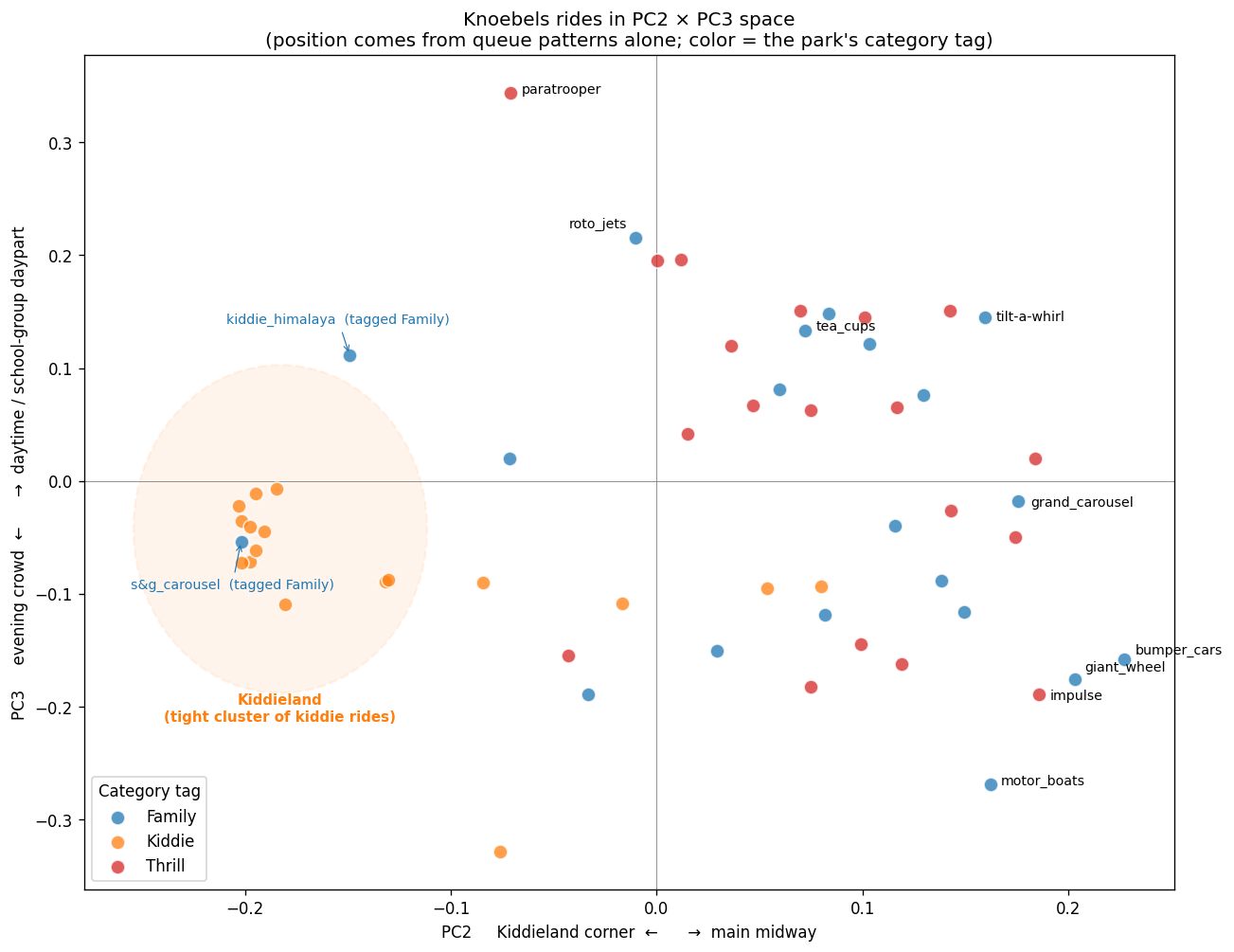
What I took away
- PCA found real structure with zero domain input. Three axes — busyness, geography, time of day — fell out of nothing but wait times, and each one maps to something you could verify against the park independently (the average wait, the GPS map, the operating schedule).
- Standardizing matters twice. Once before PCA (so small rides aren't drowned out), and again before k-means on coordinates (so the clustering is reproducible).
- The model's labels beat the official ones. Where the category tag and the queue behavior disagreed (
giant_wheel,s&g_carousel), the behavior was the truer description of how a ride is actually used. - Be willing to kill a pretty hypothesis. The PC3 "throughput" story was tidy and wrong; the data pointed at time-of-day instead.
Skipping ahead in the textbook to chase a dataset I cared about turned out to be a great way to learn this.